I hope everyone is enjoying their memorial day weekend! I spent my afternoon boating with the parents and trying to soak in as much rays as possible. Our family lives for summer sunshine and long days on the water!
This week has been an absolute blast as we re-live our wedding through all our pictures. Our very talented photographer, Arielle Peters, also happens to be my very sweet cousin-in-law and we were incredibly blessed to have such talent for our special day! Seriously, if you want her info let me know, she’s the best, in my very biased opinion!
One thing I’ve been wanting to do since the planning of our wedding is see how all my decor ideas and visions finally came together for the big day, and honestly it was EXACTLY how I saw it in my head! It’s always great when that happens isn’t it? Today I wanted to show off the elements I used!
Side Note: If anyone is interested in hiring me to help with a wedding coming up- Contact me! I would love to build my portfolio and help anyone that finds designing the challenging part.
So here’s the 411 on all the wedding decor:
Colors: Shades of mint, gold, white, purple, hot pink
Theme: Bohemian, eclectic glam
Flowers: White Ranaculas, hot pink carnations, purple misty, babys breath, potted succulents, and fresh lilac
When I first started planning out our wedding decor I knew I wanted gold and bright colors. It was going to be spring so I knew I wanted to nice soft spring color for the girls dresses, and aqua/mint just happens to be my favorite color, so that was an easy pick! Then I simply picked complementary colors to match those two.
One of my suggestions would be not to solidify your complementary colors until you go look at flowers. I wasn’t planning on having any purple flowers in our wedding and then fell in love with these beautiful wildflowers that were all purple, so that got added! And by the way it adds to the bouquets and table arrangements I say it was the best decision I made for the decor. So don’t get hung up on the dreams in your head, because something better could come along!
Alright now the details…
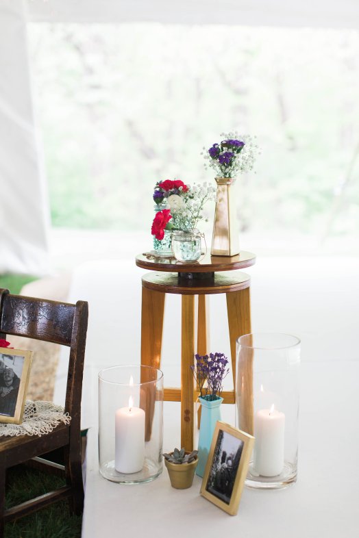
- The Guest Tables
I knew I wanted a long farmhouse table look, with the vases scattered through out the middle lining the entire length. Once I picked white tablecloths, using the gold accent of a table runner was a no brainer to add color, but not too much. It was the perfect subtle accent.
Most of the vases I used were bought at Hobby Lobby on half off weeks, or dollar tree and spray painted. The pots for the tiny succulents were a Hobby Lobby purchase and we simply painted them gold with brushes. Spray paint was bought in bulk for these projects, but it was worth it! Lastly, the dinos! My favorite part and all because of my cute, nerdy husbands love for them. I found bags of 250 dino’s through a teacher magazine of my moms, we ordered two bags and simply spray painted them gold!


For the place settings, I was able to borrow china from a family friend’s past wedding. They had all different versions of white plain dishes and silverware so each person had a different style, but I was still able to keep the simplicity of the white. Their name tag and wedding favor dinosaur sat on top as they arrived to their seat.


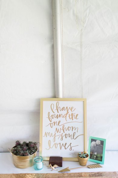
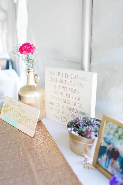
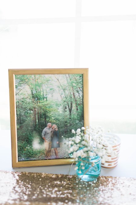
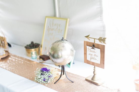
2. The Guestbook and Gifts Table
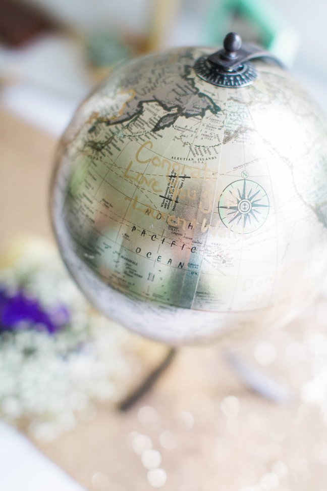
This table was really fun, because I had over time collected different wall art about starting our story together to add with our engagement pictures. I used vases that were also used on the guest tables, and also added some unique elements. Our guest book was a globe I found at Hobby Lobby. Chris and I love to travel, and we though it was the perfect piece we could use in our homes for, forever. Our cards were placed in between the spokes of a gold birdcage I also found at Hobby Lobby. My favorite part was the sparkling sequin table runner that added so much glam and color to the white linens.


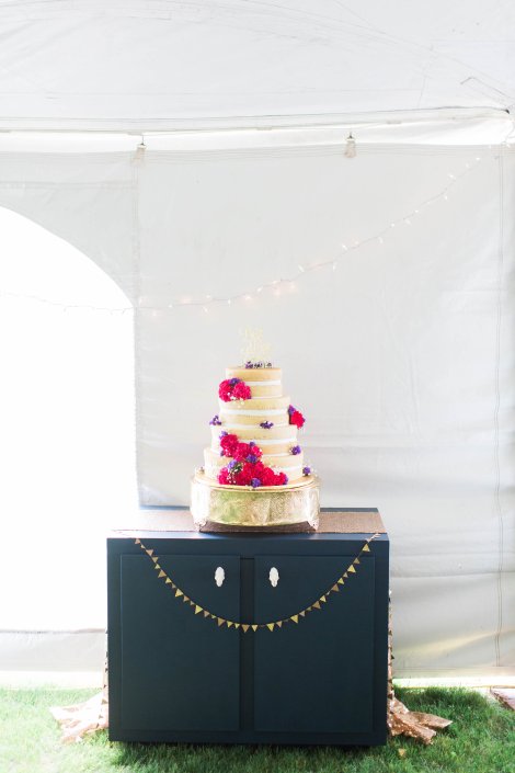
3. The Cake Table
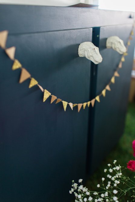
The cake table is near and dear to my heart. I found the cabinet at a little shop in Broad Ripple, Indianapolis with one of my bridesmaids. It was already painted mint, and heavy as sin, and I LOVED it! As planning went on, I knew we’d use it in our home and the mint didn’t match so I decided to bring in the navy since the guys would be wearing navy to accent the girl’s mint dresses. Then I got creative and added T-Rex heads as the door knobs. I threw on another sparkly table runner, and a cute little sparkle banner and it was perfect for our delicious naked cake!


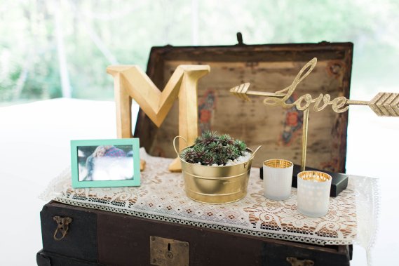
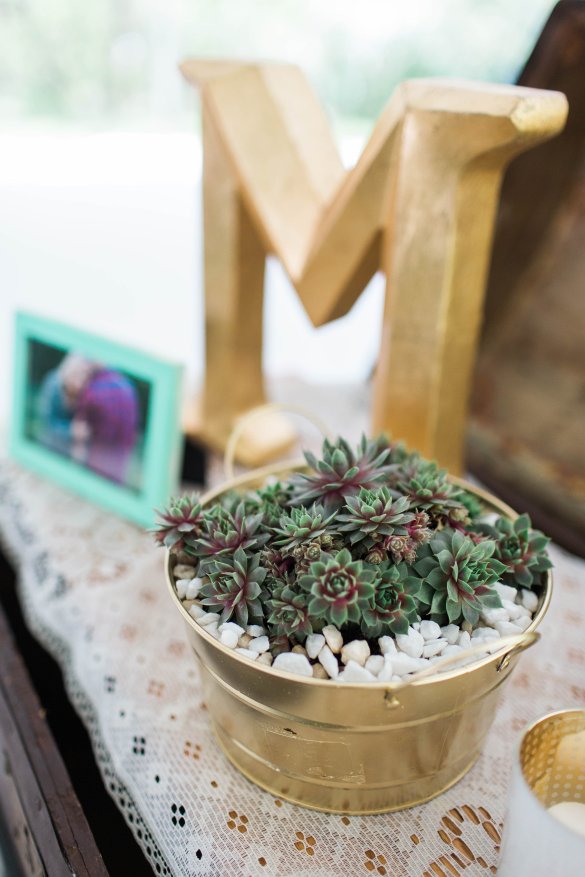
4. The Ceremony Stage
At this point on Saturday afternoon my brain was fried from putting everything together. My girls helped me a lot when putting the stage together for the ceremony the next day. The special part of it is, a lot of it was family heirlooms. The chest, the little chair, and stool were all passed down on one side of my family. We added some sweet little doily’s and more of the glam gold and flowers and it was the PERFECT mix of what I was going for.


I hope you enjoyed relishing in the beauty that is a wedding. If I could just decorate weddings and homes all the time I think I’d be in heaven!
Anyone who would like help decorating their wedding, find my contact information on the contact page! I’d love to work with you!
XOXO